The You might not need Javascript For That series has already covered how some common web elements (sticky elements, accordions, and tooltips) can be developed without depending on Javascript. This post will combine some of these techniques to create a responsive header menu, and touch on some aspects of UI/UX along the way.
1
In addition to a Codepen demo, the code for this post is available at https://github.com/chris-geelhoed/javascript-free-menu.
Advantages
A navigation menu that is free of a Javascript dependency is great when the user has turned off JS from their browser’s settings. It also ensures that any links hidden when the menu is not active will appear in the initial page load, which is helpful for maximizing SEO.
A Disclaimer
Just because a header menu can be made without Javascript, doesn’t mean that it should. This post is written in the spirit of a fun practise exercise, not a professional recommendation. Speaking practically, a JS powered nav menu is actually simpler to implement, more semantic, and is likely to be more maintainable when it needs to be modified down the road. The vast majority of sites (especially modern ones) have a JS dependency, and very few web users will intentionally disable JS in their browser.
The Objective
Before jumping into the code, it’s useful to consider the design of the header menu that you want to build. These can come in many flavours, but one standard layout would be a header with a branding logo on the left and a series of category headings distributed across the rest of the available space. These category headings could be simple links (like this website) or could trigger a submenu to be shown on click/hover (like https://www.trekbikes.com/ for example). On mobile, the web standard is a hamburger icon that toggles an overlay when touched.
The positioning of the menu is also important to the design, and could be static, fixed, or sticky. Currently, fixed headers are the most popular option. Although they add some complexity, they are useful because they ensure that navigation is readily available to the user at whatever scroll position they happen to be on the page, and this becomes increasingly important on mobile where content is likely to be stacked and become very tall (and therefore take a long time to scroll through). The downside of fixed menus is that they permanently consume page real estate, so it’s important they they aren’t too tall. Sticky menus (like https://designatdarden.org/) are a bit more rare, but are handy when you only need to make some of the header accessible as the user scrolls down the page. I’ve created a post on sticky positioning here: http://www.chrisgeelhoed.com/you-might-not-need-javascript-for-that-position-sticky/.
Other considerations include maintainability and flexibility. Ideally, the menu should be built in such a way that additional navigation items can be added and removed without breaking the layout, and the design should be able to handle categories and links with both short and long names. It should also be coded such that future adjustments are easy (eg if the color scheme, spacing, size, or branding icon need to change).
Finally, it’s good practice to avoid creating any jarring/abrupt transitions. Specifically, the submenus should appear to fade in or move in, a hamburger icon should provide the user feedback when touched, and any kind of unsightly jank should be eliminated.
Getting Setup
A full header menu is a somewhat complex undertaking, and replacing plain CSS with SCSS is useful in the case. To support this, I’ve elected to create a basic Gulp build process that will translate SCSS to CSS, and also provide hot reloading, autoprefixing, and sourcemaps. In addition to other features, SCSS supports the use of variables in CSS, which is helpful for defining reusable breakpoints, heights, and colors.
Page Structure
With SCSS compiling, we can insert some HTML scaffolding into an index.html file and get to work. I like to use this structure as a starting point:
1
Handling Spacing
Managing spacing on the web is always important, and there are two important spacing problems to solve with fixed position nav menus:
- The site’s content will fall behind the header –
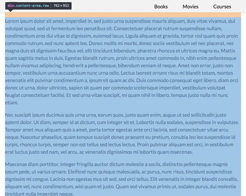
position: fixedaffects page layout in the same way asposition: absolute, which means that the other elements on the page will no longer respect the space occupied by the header and position themselves as if it was not there. Practically speaking, this means that the top of the.site-contentelement will fall behind the header. One way to compensate for this is to add padding to.site-contentsuch that it offsets the height of the header perfectly (which is why setting a defined height on the header is helpful). - The spacing below the header and above the footer should be consistent for all pages – At this point the header is no longer blocking the content, but it’s not giving it any breathing room either. Although this could be solved by simply adding padding beyond the height of the header, I prefer to set a margin on the child element of the our content (
.content-area, in this case). This decouples offsetting the headers height and giving it appropriate spacing, and also looks much nicer when viewed from Chrome’s dev tools (my dev tools of choice).
Menu Toggling
A good header menu should consume minimal page space and be easily accessed by the user. On desktop, the categories should expand into a list of links when clicked, and retract when clicked again. On mobile, a hamburger icon should expand into a sitemap when touched and retract when the user touches away. This behavior is most commonly implemented with JS, but can be replicated by inserting checkboxes, adding labels to them, and then styling the labels while hiding the input itself. The inner workings of this technique are demonstrated here: http://www.chrisgeelhoed.com/you-might-not-need-javascript-for-that-accordions/
Animation
Adding animations to navigation toggling makes things feel more natural and contributes to the overall user experience. In this demo all animations are exclusively transitions on the opacity and transform properties, which makes sense for the following reasons:
- Since the height of the dropdown should be determined by the links inside it, it cannot be easily transitioned (ie transitioning
height: 0px;toheight: auto;does not work). - Instead of animating height directly, an alternative approach is to animate
max-height. To make this work, themax-heightis originally set to 0, and then set to a large value (A height which will always be greater than the actual height of the dropdown) when active. This does the trick, but results in a delay when the dropdown is toggled to inactive (as themax-heightstarts at a value that is larger than the actual height). - Unlike
marginandleft,opacityandtransformtransitions allow the clients GPU to be used, which makes them more performant and smooth.
Mobile Concerns
In the case of mobile use, it’s important to keep some minor details in mind:
- As the site grows and navigation links are added, the height of the menu screen may grow to exceed the height of the viewport. Defining the scroll behavior as overflow ensures that the full navigation remains accessible when this happens.
- Mobile safari has the habit of adding a native option bar to the bottom of the viewport, which often blocks parts of the webpage. Adding extra padding to the menu screen can be done to make sure that the items at the bottom of the screen can be accessed when this occurs.