If you have been writing CSS for any length of time you probably already know of the value that Flexbox has brought to Web Development. Vertical centering, evenly distributed spacing, and stretch to fit layouts were three major issues that Flexbox has effectively solved since its introduction. And with its great success it comes as no surprise that the web development community has been flooded with articles about how to get started with Flexbox and how to integrate it into your work.
And by this point (December 2017) Flexbox has definitely hit the mainstream. Bootstrap, the most popular CSS framework on the web, has embraced Flexbox based layouts as part of their Bootstrap 4 release. React Native, a framework designed to create mobile apps, has elected to use the Flexbox model as it’s primary layout system, despite the fact that these apps do not parse CSS. As a somewhat new developer myself, I learned how to use justify-content and align-items before I learned how to use floats or how to make a clearfix.
At this time I already know that Flexbox is awesome and use it daily. And because of this, I’ve actually noticed that certain things about Flexbox are either weird or buggy. As such I’ve written this post with the intention to outline things that are either confusing or just bad about Flexbox (More accurately, bad about some browsers implementation of it’s spec), and provide workarounds in each case.
The Weird Stuff
Predicting flex-grow behavior can be tricky
The flex-grow property is great because it allows elements to resize responsively, but it doesn’t operate in a vacuum. Check out these next two pens:
1
1
Notice how the CSS is the same, but the two children elements are stretching to different widths? This is because the text content contained in the first child affects the elements width. Actually, there are 4 factors to consider in order to understand how flexbox defines the widths of flex-items:
- The first thing to consider is the pre-flex width of the element. If there are
width,min-width, ormax-widthattributes declared on the child then these will define this pre-flex width. If there is not, then this width will be defined by the natural width of the element. By ‘natural width’, I mean the length of a block containing text, the size of an image, or whatever the element would normally be withwidth: auto;. This acts as the starting point from which the element will grow from. This explains why the example above shows the text containing child as longer than the other – it starting growing from the natural width of the text while its sibling starting growing from a width of 0px. - The flex-grow rate. This is a unitless measure of how quickly the element will expand to fill the parent. An item with
flex-grow: 0;(which is the default) won’t grow at all, but items with values greater than zero will expand as much as they can. It’s important to note that the absolute value offlex-growisn’t important, but what is important is an item’s value relative to its siblings. For example, in a flex container with two children you could setflex-grow: 1;on each child, orflex-grow: 9000;on each, and the result would be the same since1 / (1 + 1)is mathematically equivalent to9000 / (9000 + 9000). - flex-shrink. This works the same as
flex-growbut applies when there is a space deficit rather than a space surplus. So a setting offlex-shrink: 0;would remove a flex-item’s ability to shrink itself if it’s parent element ran out of space. - flex-basis. This property can be used to override the pre-flex width explained above. For example, setting
flex-basis: 0px;on the example above would ensure that both children start growing from 0px, and would therefore grow to equal widths. This property is really handy!
1
Another article that I found to be a really good resource for this topic can be found here:
http://gedd.ski/post/the-difference-between-width-and-flex-basis/
Why is there no justify-self property?
Once display: flex; has been declared on the parent element justify-content and align-items become available to use. This allows you to vertically and horizontally center, side-align, or space out the child elements within the parent, but what if one child needs to break the pattern? For example, maybe the first child needs be aligned at the bottom, and the rest should be aligned at the top. In this case you can use the align-self property to override the default behavior and achieve your layout:
1
Great, but what if instead of breaking the vertical layout we’d like to break the horizontal one? Specifically, what if we wanted the last child to be right aligned, but the rest to be left aligned. A newcomer to Flexbox might check for a justify-self property and be surprised to learn that it does not exist. For some reason Flexbox gives explicit control of cross axis positioning at both the parent and child level, but only gives explicit control of primary axis positioning at the parent level.
Thankfully, the work around is actually somewhat simple – just use margin: auto; to fill any space that you need filled:
1
The Buggy Stuff
Although all major browsers support Flexbox, some do it better than others. I’ve experienced all the following bugs firsthand at some point, and some of them took me some time to figure out.
Absolutely Positioned Elements can Affect Document Flow on Internet Explorer
Most of the time when you declare position: absolute; on an element the other elements will position themselves as if that element is no longer there, but I’ve come across times in which this is not the case. Check out the following pen:
1
Here we have 3 flex items, with one of those items being used to create a transparent background layer. Although the background layer is the last child in the parent, declaring position: absolute; will remove it from the document flow and allow the second child to move to the right of the container. Unfortunately, things behave differently on Internet Explorer 11:

Internet Explorer allows the last child to hold its right position and pushes the second child to the center of the container. While this bug is uncommon and can easily be overcome (You could move the layer element to be the center child, or better yet create a separate container for the two purple elements), it shows the need to be careful (aka test!) when using Flexbox on Internet Explorer.
Internet Explorer Fails to Parse Common Syntax
Most of the time CSS understands that zero is unitless. Practically speaking, I mean that writing something like margin: 0; is effectively the same as writing margin: 0px;, margin: 0%;, etc. In most browsers this concept also proves to be true for the flex property. For example you could write flex: 1 1 0;, which would set flex-grow: 1;, flex-shrink: 1;, and flex-basis: 0;. However, I have found that Internet Explorer fails to recognize this, despite it being able to recognize flex: 1 1 0px;
1
And this is what renders on IE11 (That’s right – it renders nothing!)
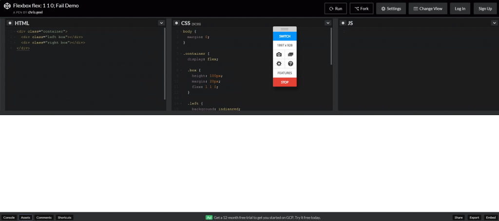
Strangely enough, I’ve found that splitting up flex: 1 1 0; into flex-grow: 1;, flex-shrink: 1;, and flex-basis: 0; will also fix the problem.
The use of min-height causes align-items: center to Fail on Internet Explorer
Check out the code:
1
And Internet Explorer being caught in the act:
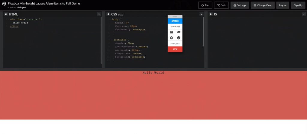
For me, the solution to this bug is just as strange as the bug itself – just declare height: 0;
The Use of Min-Height prevents Flex-items from Stretching
Similarly from the issue above, setting a min-height on a flexbox parent container will also prevent its children elements from stretching to the containers width.
1
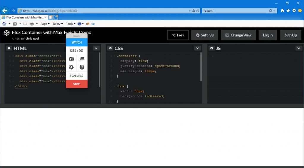
Once again, doing this in Internet Explorer causes things to disappear.
Summary
After learning about all the great things that Flexbox has to offer, I was really discouraged when I encountered these bugs for the first time. I felt that it behaved unpredictably and didn’t want to deal with any possible browser inconsistencies. Since then, however, I have learned that the vast majority of these bugs are well documented and can be handled quite easily. These days I find myself using Flexbox for a large number of my CSS layouts, and just make sure to test carefully before pushing my code to production.